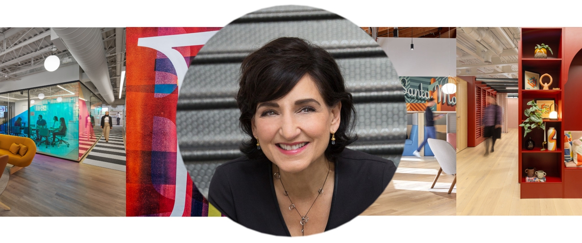
Theories of Design: Color as a Tool for Workplace Optimization, Featuring Laura Guido-Clark
Feb. 17, 2025
Industry Trends, Cool Workspaces
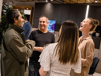
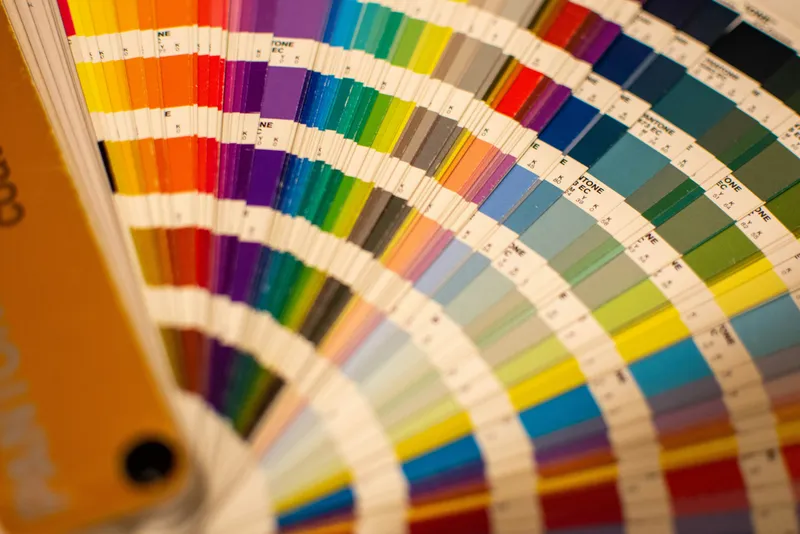
Color is more than just a backdrop or aesthetic tool - it’s a game-changer. When it comes to designing the optimal office environment, few elements have the same immediate and profound impact as color. According to color expert Laura Guido-Clark, founder of LOVE GOOD COLOR, the right hue can do far more than make a space look good - it's a powerful tool that can shape emotions, influence productivity, and even foster connection within the workplace.
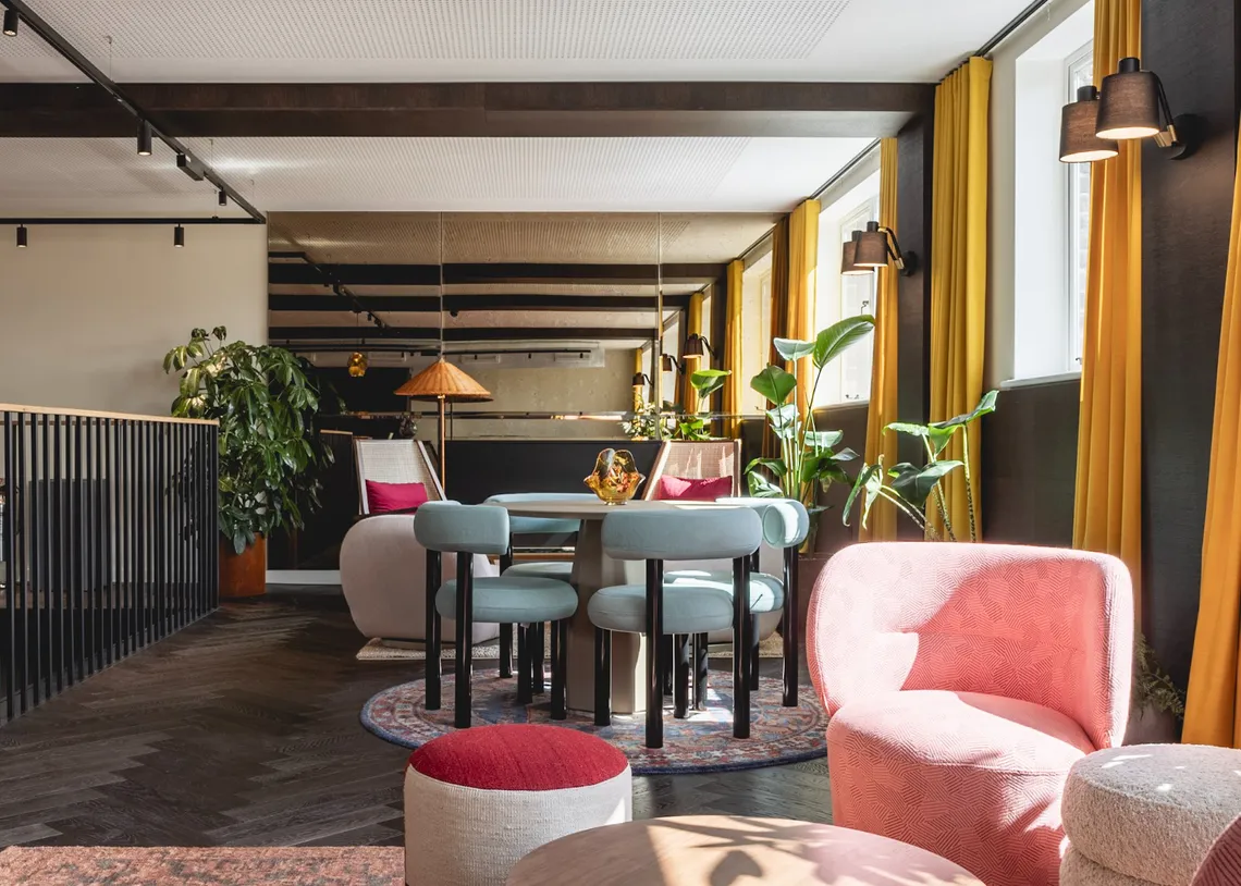
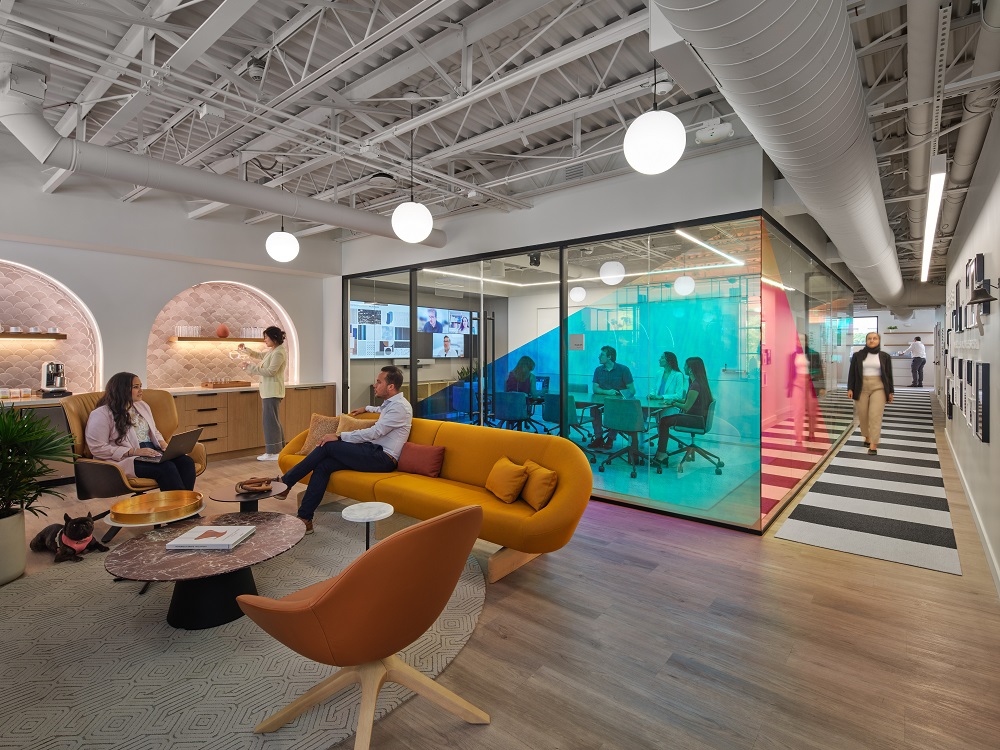
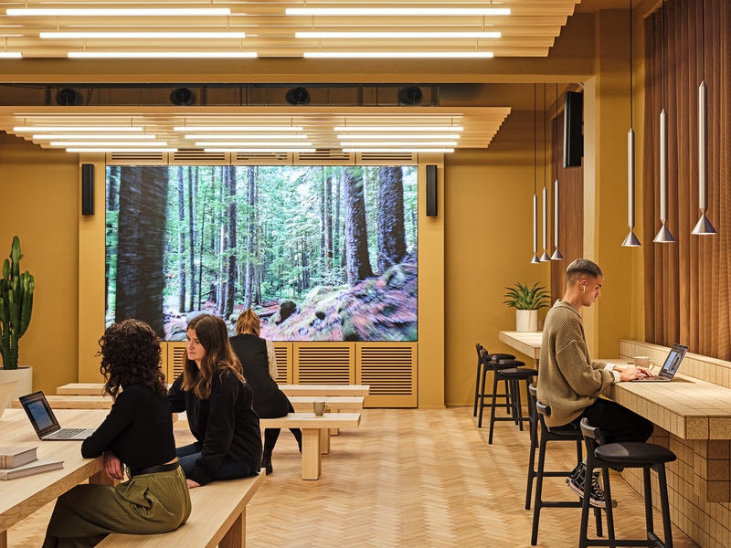
The Science Behind Color and Emotion Color and emotion are deeply connected, with the ability to influence how we feel, think, and work. Color isn’t just a visual experience - it’s a sensory one. Every color has a specific wavelength, and these wavelengths interact with our brains and bodies in different ways. “Cool colors like blues, greens, and purples are calming and relaxing. When we have these feelings, we tend to be more introspective and ideas can flow,” Laura says. “In contrast, warmer colors like reds, oranges, and yellows stimulate the brain and improve focus and performance.”
But the intriguing fact is, it’s not just about seeing these colors. “Because color is a wavelength, even if you don’t see it, you can feel it - it is absorbed through our skin,” she adds. This can influence everything from the mood of the room to individual productivity.
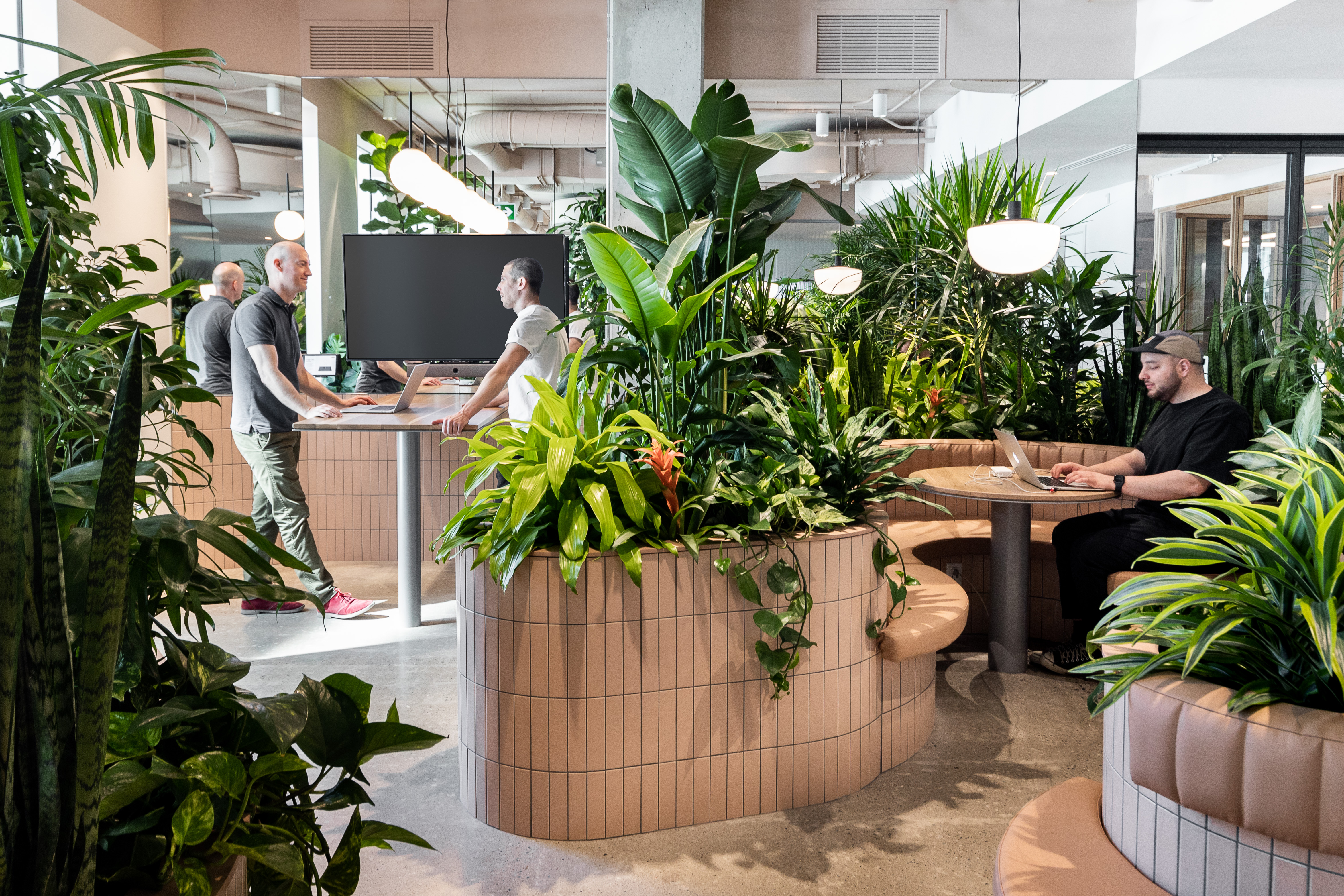
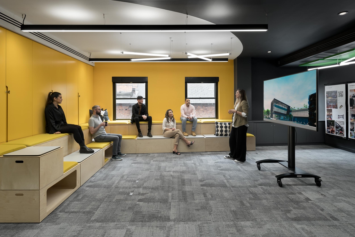
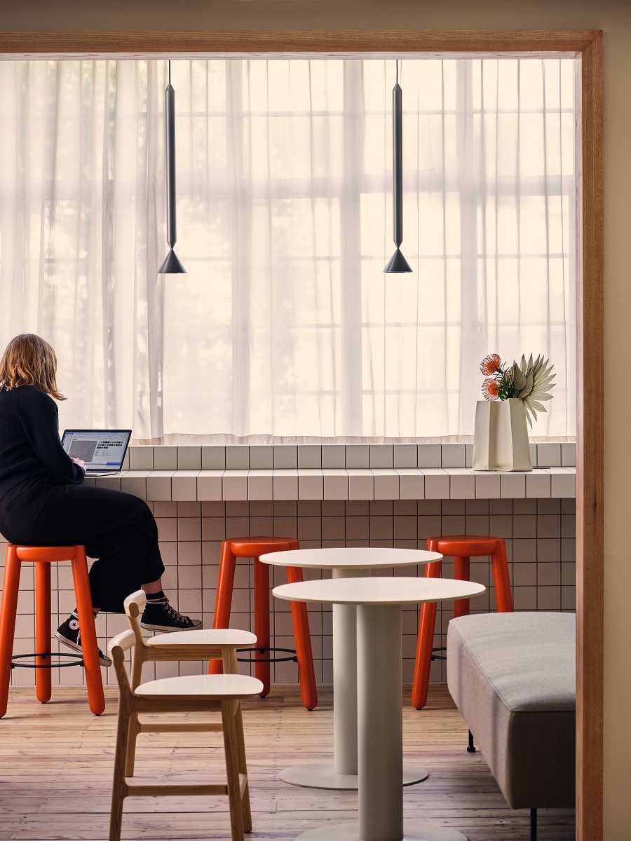
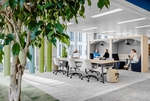
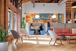
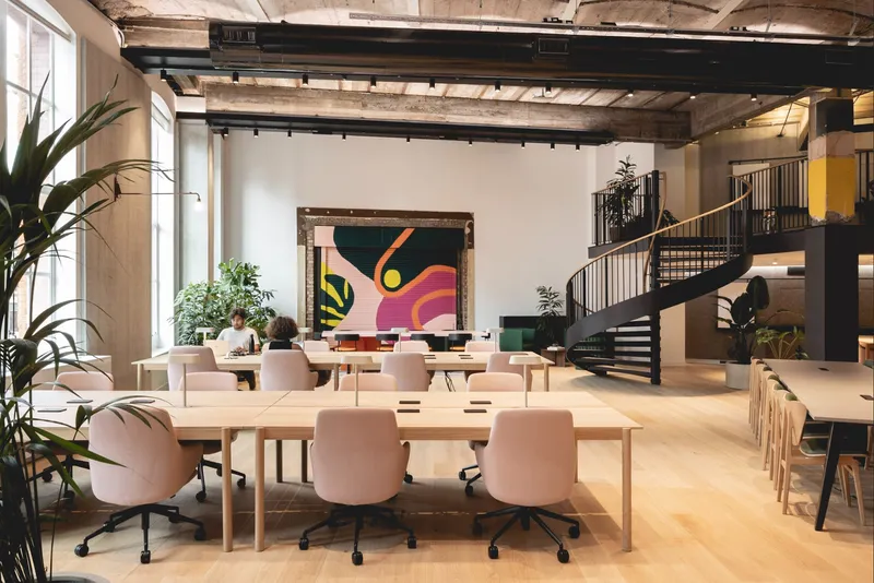
When working with color, Laura’s team begins with one key question: What feeling do we want to evoke in this space, and what work will it support? For example, a collaborative space might benefit from vibrant, high-saturation colors that promote energy and creativity, while areas meant for deep focus may benefit from desaturated, muted tones that encourage calm and concentration.
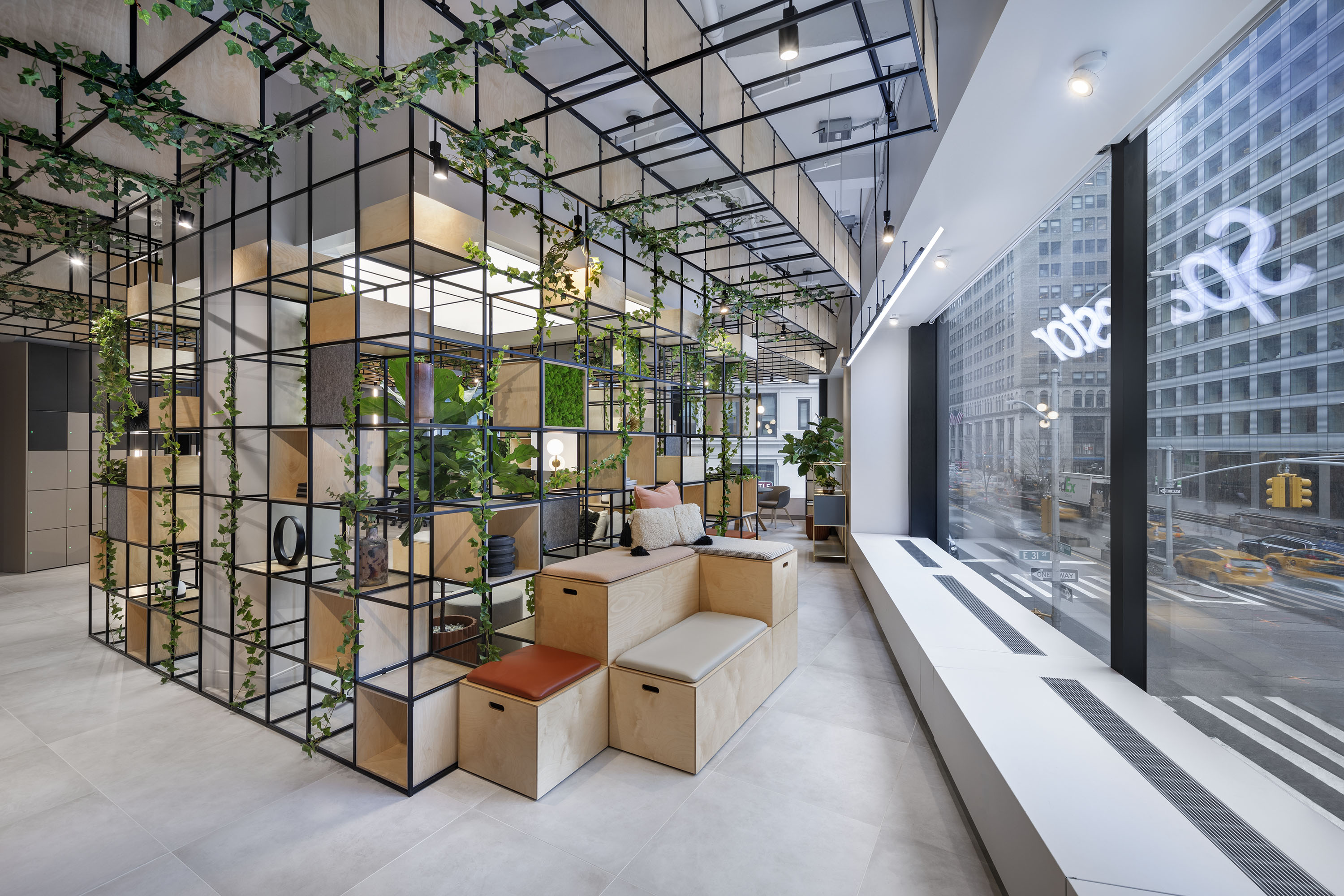
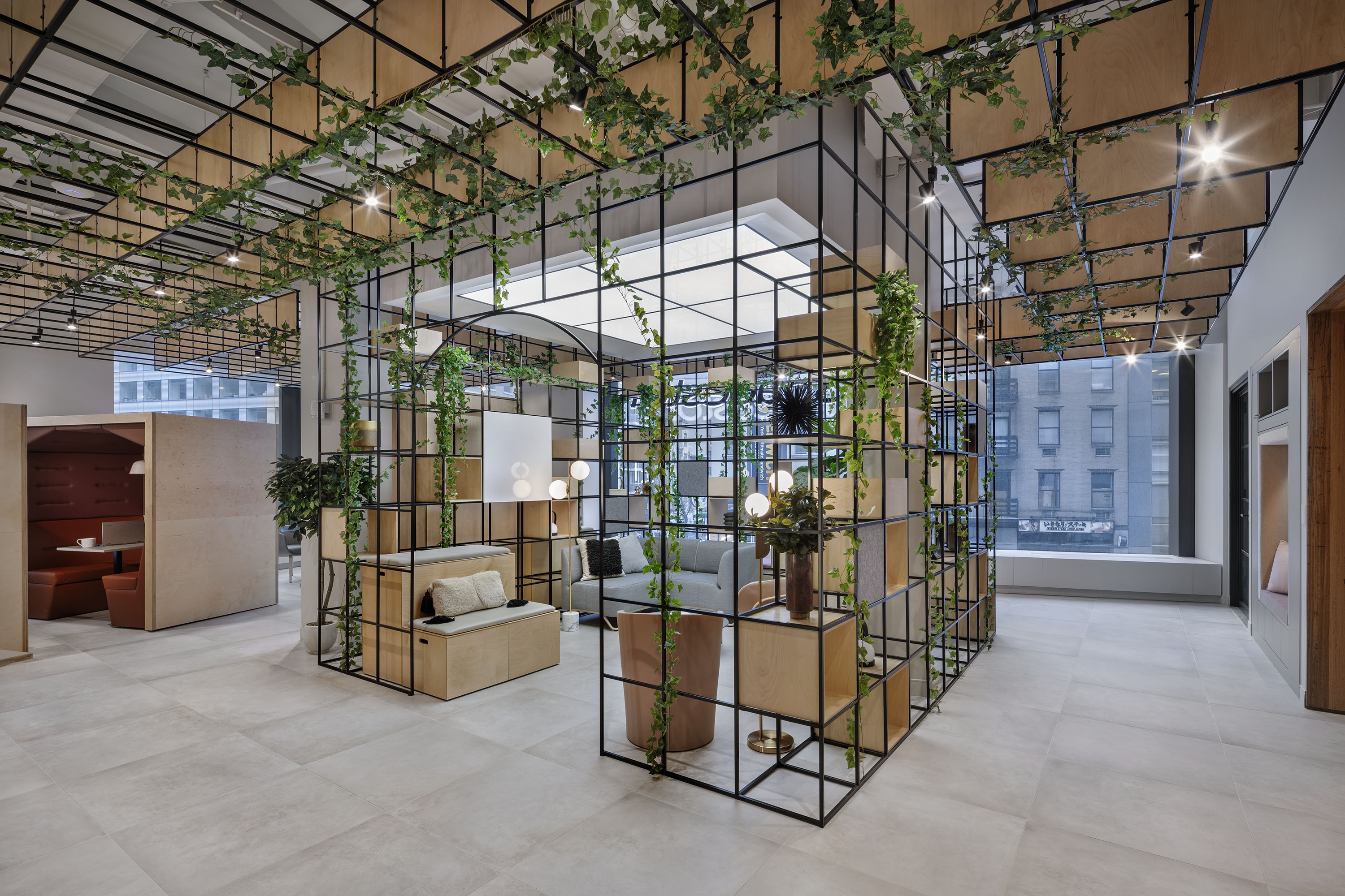
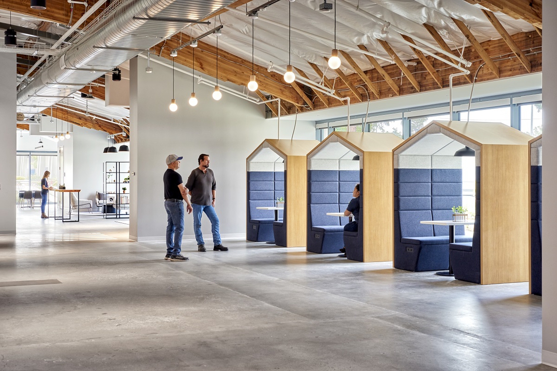
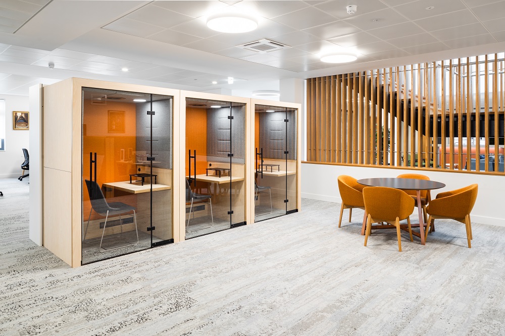
Moving Beyond Trends: Designing for Human Needs While many designers and users may chase the latest color trends, Laura’s approach is refreshingly rooted in human needs. “I constantly think about the brand and the people who visit and work in the location, and what they need in each proprietary space.” she explains. Each area of an office is programmed to address different needs, whether it’s fostering creativity, improving focus, or encouraging collaboration.
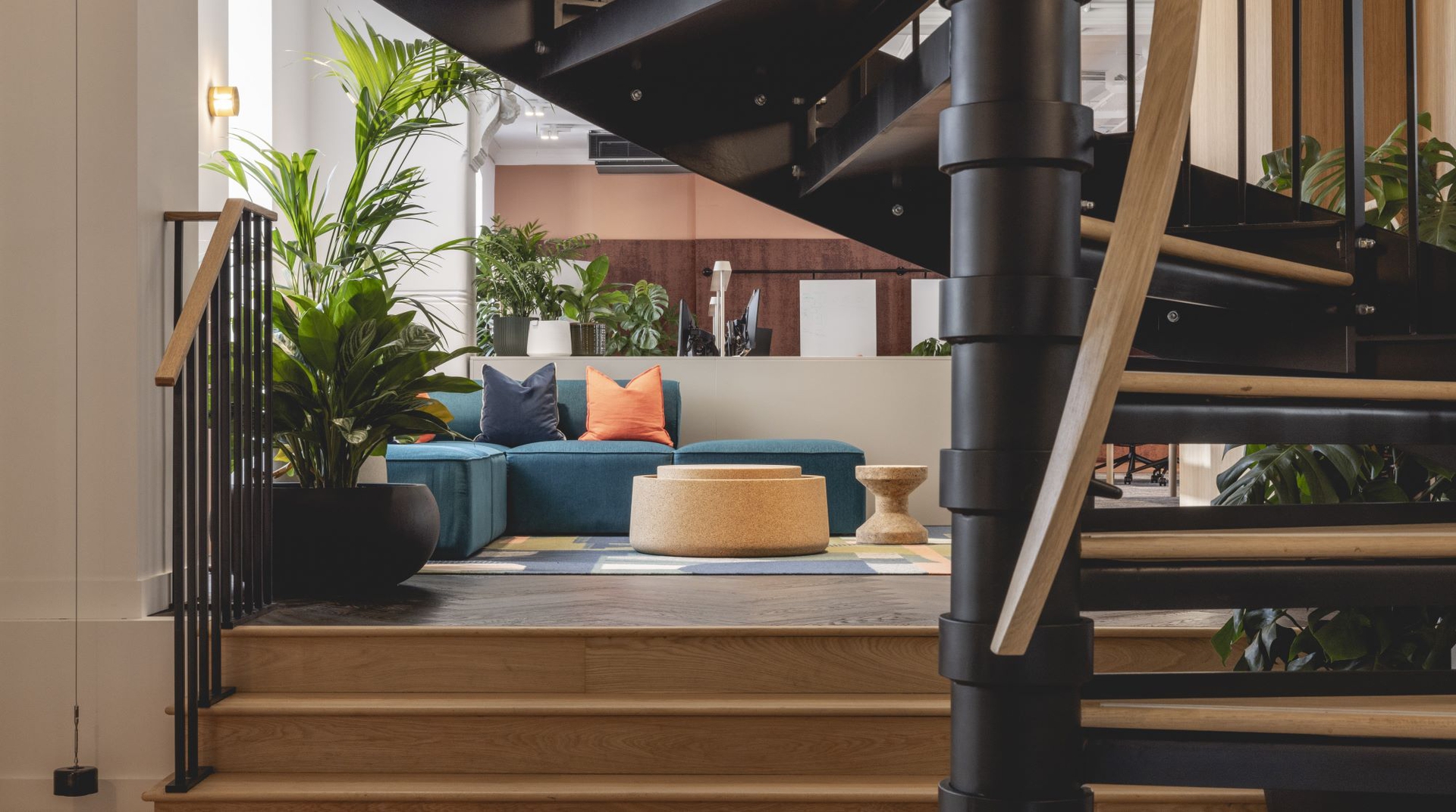
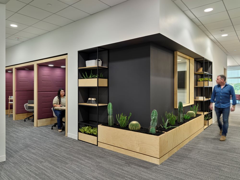
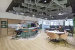
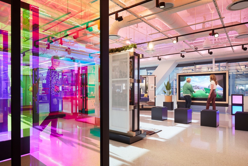
“We’ve been seeing a desire for less cluttered, more sensory-rich spaces,” she says. “Offices are becoming increasingly flexible to support hybrid and remote work styles, with an emphasis on sustainability and using locally sourced, recycled materials like reclaimed wood and bamboo.”
Lighting is another essential component of the sensory experience. “We respond positively to natural light and views of nature,” Laura notes. “The right light can transform a space and even enhance how color is perceived.”
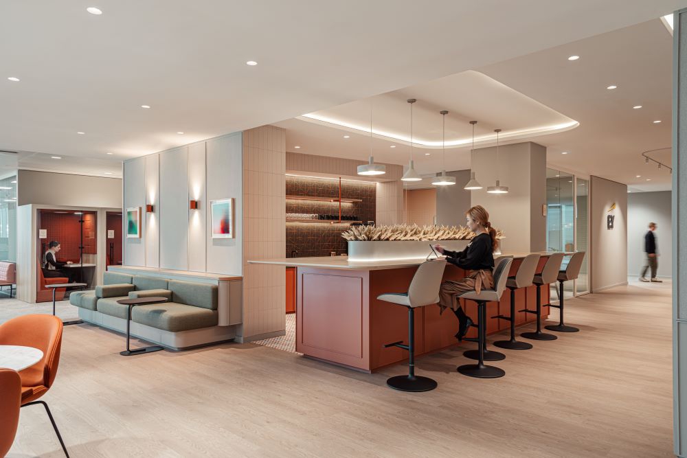
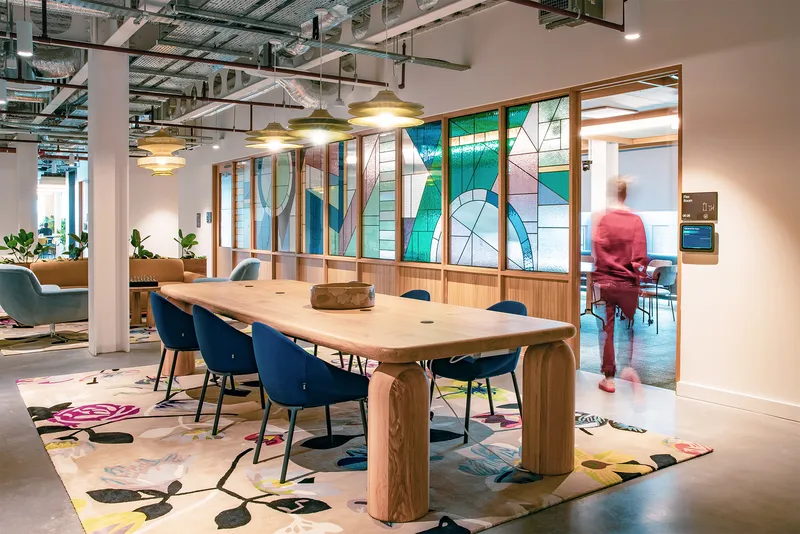
Balancing Brand Identity and Functionality One of the biggest challenges in designing a color palette for a workspace is balancing a company’s brand identity with functionality. “Most importantly, brand identity colors should not be everywhere nor dominate a space.” Laura advises. “By identifying spaces that are well-suited for brand colors like lobbies the brand color has more impact. It becomes diluted and less impactful if it is overutilized.”
Rather than allowing brand colors to overwhelm the environment, Laura’s team uses them strategically, ensuring they serve the intended emotional or functional purpose of each space.
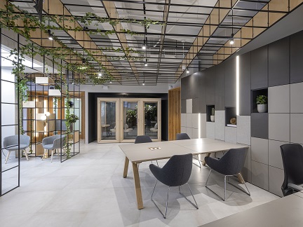
Transformative Projects: Adobe Founders Tower One memorable project where color played a transformative role was the Adobe Founders Tower in San Jose, California. Laura collaborated with Adobe and Gensler on this project, applying her color system, Love Good Color, to create spaces that supported both the practical and emotional needs of the workers.
“Every workspace in the tower was designed with purpose, using color to create an environment where people felt a sense of belonging,” she recalls. “It was a space where people wanted to return, even after the pandemic. The color scheme fostered a connection to the community and to the space itself.”
The Future of Color and Lighting in Workplace Design Looking to the future, Laura is excited about the potential of dynamic lighting and color technologies. “Innovations in color technology should focus on shifting light quality and color to support the various tasks needed throughout the space.” she recommends. “In healing spaces, such as hospitals, it is proven that people heal faster when having control of their lighting conditions. With this in mind, allowing individuals more control over their lighting would improve their workplace experience.”
As we continue to innovate in the workplace, creating environments where people thrive will remain at the core of design decisions. Laura explains that “Lighting impacts the overall visual aesthetic as well as employee mood and productivity. Cool lighting can help promote attention and focus and warm lighting can create inviting atmospheres, conducive to relaxation and collaboration.”
With the ability to tailor lighting and color to different needs throughout the day, we can create spaces that feel more supportive, adaptive, and human.
Thank you!
Your details have been submitted
Submit Your Details Below
Learn more about how we can support with your workplace color strategy!